QOMPLX: Using Scylla with JanusGraph for Cybersecurity

QOMPLX is a company dedicated to solving complex problems, such as tackling the daunting world of cybersecurity. In this domain you need to be able to support a data model capable of rapid and repeated evolution to discover and counter new threats. This is one key reason why a graph database model is more applicable to QOMPLX’s use case than the rigidly-defined and statically-linked tables of a relational database.

![]()
QOMPLX partnered with the graph database experts at Expero to implement their system with JanusGraph, which uses Scylla as an underlying fast and scalable storage layer. We had the privilege to learn from their use case at Scylla Summit this January, which we share with you today.
WATCH QOMPLX AND EXPERO AT SCYLLA SUMMIT
This story actually began years before at Scylla Summit 2019. At that event Brian Hall, Graph Analytics Practice Lead at Expero, had presented on Incorporating JanusGraph into Your Scylla Ecosystem. This presentation sparked a conversation with QOMPLX’s Angad Salaria, who was in attendance, and resulted in the ensuing work which they co-presented.
Centering the Cybersecurity Analyst
Angad explained how Q:CYBER, QOMPLX’s cybersecurity solution “centers around the user, the cybersecurity analyst. The motivation we’ve had at QOMPLX has been to enable and empower the network defenders with tools that they can use to gain insights into how attackers can exploit transitive and counterintuitive information schemes to pivot around a network using techniques such as lateral movement or privilege escalation.”
Citing the rampant nature of cybersecurity incidents, Angad noted, “as a cybersecurity analyst you find yourself at the center of the storm, asking key pertinent questions such as ‘Has an asset in my network been compromised?’ ‘Is it a high value asset?’ ‘Can high value assets be reached from the compromised portion of my network?’ We find that graph technology is better suited at answering these kinds of questions.”
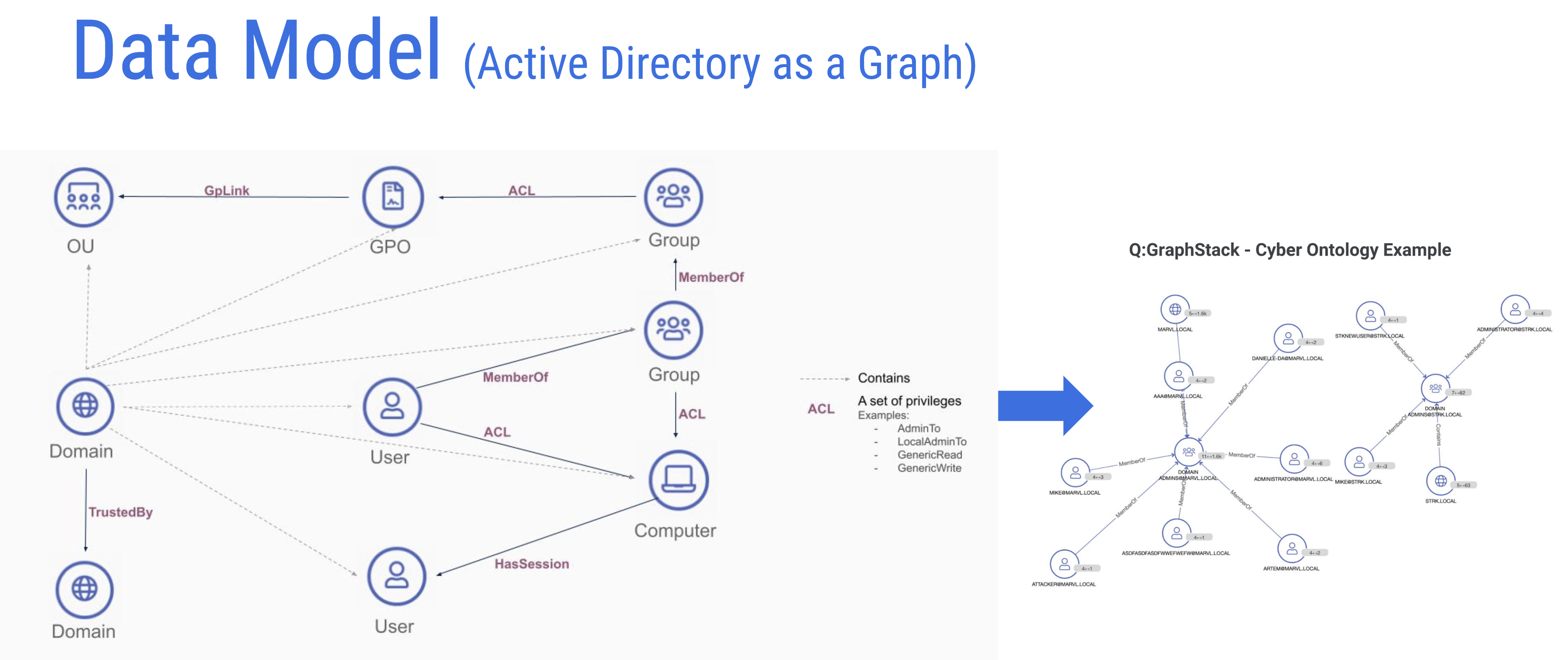
QOMPLX ingests Microsoft Active Directory schemas and renders them in graph data representations for JanusGraph.
“In this particular use case what we do is we ingest Active Directory data from the customer’s side and produce a graph representation of that data. Active directory itself, essentially, is a database at the end of the day. But if you want to ask more specific questions such as ‘What kind of attack paths exist to key assets?’ ‘What access patterns are structured in my directory?’ — You know your traditional Active Directory provided list view and querying paradigm is going to fall short.”
Demonstrating Q:CYBER
With that, Angad provided a demonstration of the Q:CYBER solution to highlight some of the features they have been developing over the past few months.
“What you’re looking at over here is our cybersecurity decision platform. I’m logged in as a cybersecurity analyst. Essentially this particular page you’re looking at trends and key summarized statistics that are representative of your network. Very quickly I can start reasoning about deviations from standard policy and best practices in directory services. As an example, the number of non-admin users able to create computers. Let’s say that spikes suddenly. I might be interested in finding out why that happened.”
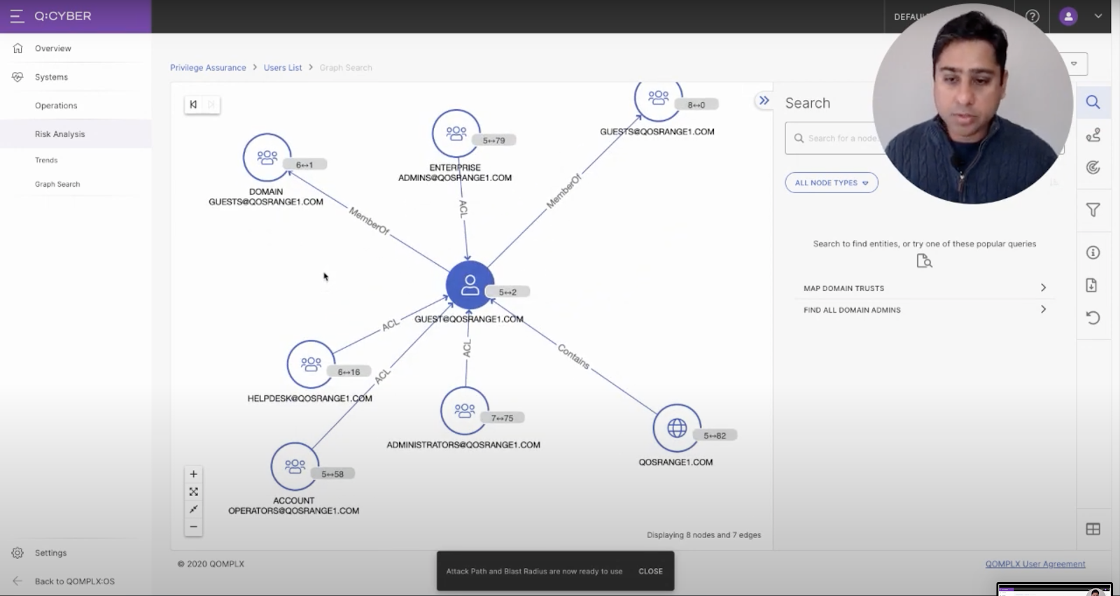
The Graph Canvas in QOMPLX’s Q:CYBER platform.
“You could produce a list view but for the purpose of this demo the fun part is the graph canvas. I pivoted to that particular user account — in this case the guest account — and you can start exploring neighboring associations. In this case we see it’s a member of a couple of guest groups. And then there are administrative groups that have ACLs [Access Control Lists] which are privileges to that user account.”
Angad showed a variety of ways to graphically organize and view the account topologically which you can watch in the full presentation. “By the way, as I’ve been doing these graph traversals, these are backed by the JanusGraph and Scylla infrastructure, whenever there are Gremlin queries I’m invoking.”
“One last key lesson learned: never allow the user to explode the graph to obnoxiously large size. So we produce filters proactively when we see that possibility of the graph being explored that it’s obnoxiously unmeaningful.”
Angad then drew attention to two particular nodes. “Over here this administrator has a session on this workstation. What I’m going to do is pivot to a different view. We’re going to produce a couple of attack paths over here.” The page redrew instantaneously.
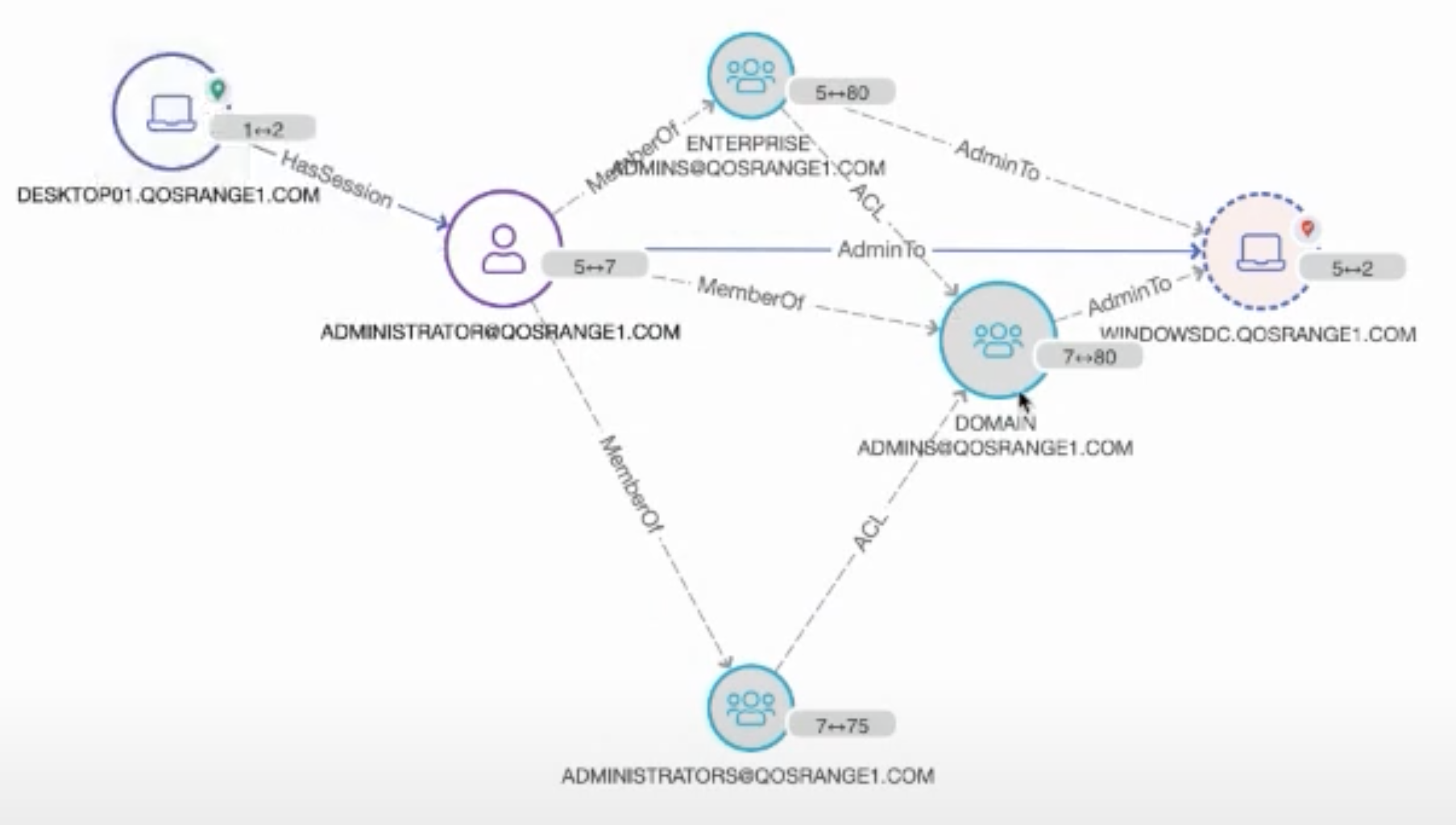
“When might this workflow be useful to an analyst? Let’s say this desktop [DESKTOP01.QOSRANGE1.COM in the image above] has been compromised. Perhaps there’s a local workstation account [ADMINISTRATOR@QOSRANGE1.COM] that has local admin rights to this desktop. Well guess what? For the duration that this administrator has session on that workstation, if that actor, that local account holder, is a malicious actor using some fairly common and readily available techniques, that actor can compromise — get hold of credentials — of this administrator account. At that point this account is compromised. As you can see you have multiple paths to the domain controller on the network.”
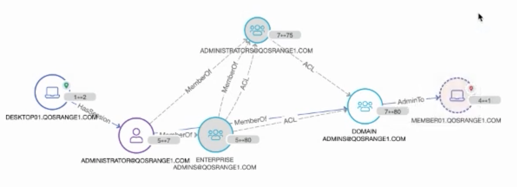
Following the graph in a different direction, Angad was able to immediately show what other systems that compromised account had access to. “There might be other other particular assets I might be interested in finding out if they are now vulnerable. In this case we see this member server. Perhaps there’s credit card information stored over there, or there’s a database hosted over there with sensitive user information. At this point you want to get ahead and start taking actions to protect that information. What I did in this case was produce attack paths to very key specific assets I was interested in protecting.”
The QOMPLX Q:CYBER platform can instantly and clearly show the “blast radius” of vulnerabilities that can quickly spread across a network just a few hops away from a compromised account.
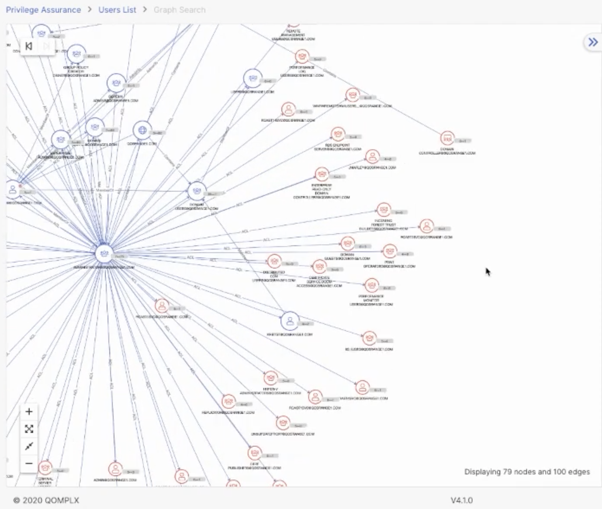
“Perhaps I want to find out what other assets that might be vulnerable at this point. What I can produce is the ‘blast radius’ — that is what we call it — which essentially represents the outreach from the central focal point n hops out — in this case that’s four — so all these red nodes over here denote objects that are reachable in that radius.”
Angad then showed the platform view where users can start applying capabilities available on our core platform to the same data set, such as a notebook facility to perform more power user activities. For instance, they could directly write Gremlin queries to that same graph data set; JanusGraph in this case. The platform provides convenient integrations into datasets hosted on other stores such as relational [RDBMS], time series or wide column stores such as Scylla.
The Architecture
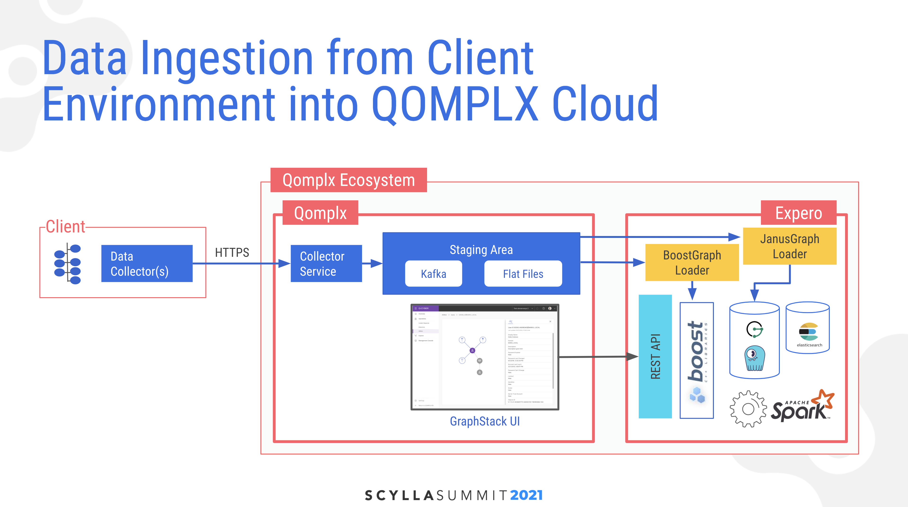
Angad described the architecture for the system beginning with ingestion of data from the client. They have a collector service which uses secure HTTPS on a set of data collectors, which ingests into a single source of truth in a staging area. Here data is also transformed and put into multiple extraction routines, including both Kafka topics for live streaming and flat files for batch processing. “That has been a key learning to us… There is no one magic data store that solves all problems. So based on your needs, insights, and analytics required you might want to place it in different data stores, including in-memory, which in our case is powered by BoostGraph.” His block diagram also noted that beyond JanusGraph and Scylla, there was also Apache Spark and Elasticsearch in his analytics stack.
Lessons Learned
Expero’s Brian Hall then shared some lessons learned. “First of all, as if we needed another reminder, graph analytics jobs are tough and computationally expensive. While not all applications require sub-second responses, in our case our SOC [Security Operations Center] analysts did. We couldn’t afford to wait several minutes or hours in order to do some of the path analysis you saw in Angad’s demo.”
Brian pointed out that OLAP workloads and Janus are commonly offloaded to Spark. While they tried that well-worn path as a baseline for generalized workloads, “for the SOC analyst thirty minute response times just wasn’t going to cut it.”
“Shorter path queries would return in several minutes or hours. And then longer queries just simply were not feasible, taking days or simply not ever completing. Therefore for a small number of the key computations we opted to use something called BoostGraph.” In that, a minimum subset of the graph was stored in memory. “While you can’t use it as a proper graph database, you can use it for very specific computations. Furthermore it can be spun up and down as needed so that you don’t have runaway hosting costs. And you can manage instance sizes to use only the memory that you require.”
Another key takeaway was whether updates coming in from clients’ Active Directory instances would come in as a batch or streaming messages. “Streaming presents problems in sequencing of the data. For instance, what happens to edges when edges come in for the vertices that they connect? How do you send over deletions in Active Directory? And in general detecting changes in AD is just not that simple.”
“We also learned wholesale batches posed challenges. Rather than doing upserts into fully populated graphs, we opted to keep multiple revisions of a client’s AD: yesterday’s version, today’s, the day before yesterday, etc. Due to the nuances of how that was organized at the client, a single client may have several AD forests and several days’ versions of it. So we had an explosion of graphs possible.”
“A big new learning was something that required a patch all the way back to the Janus community was how to handle this high number of graphs. Normally you see in graph discussions is the notion of how do you deal with very, very big graphs. Our problem was slightly different in that what we were dealing with was lots of normal-sized graphs rather than single big ones. So we found ourselves traipsing through a part of the code base that needed some surgery and was somewhat immature. Namely the ability to add and remove graphs on the fly; something called the ConfiguredGraphFactory.”
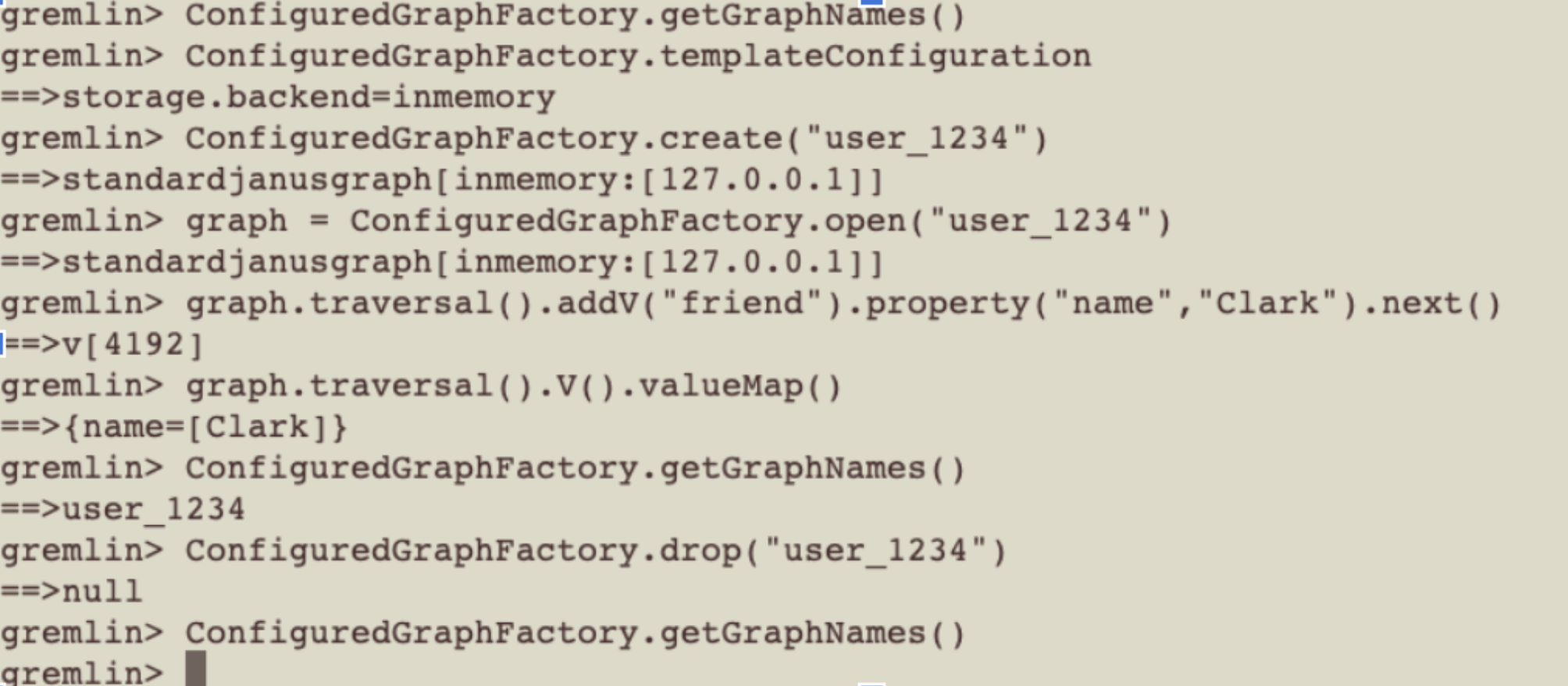
“As we got into this part of the code base we also recognized that Janus did not handle high cardinality of graphs per server very well as it put a lot of memory heap pressure. We had to actually spend some time working on cleanup routines as well.” (This work resulted in JanusGraph pull requests 2148, 2237, 2150.)
Monitoring and DevOps were also key considerations for live operations. For this, employed Prometheus and Grafana for observability, and Gitlab pipelines for CICD. Brian advised, “Don’t cut corners here, as you have multiple representations of graph data in different data stores, making sure they’re in sync is non-trivial. QOMPLX has a sophisticated authorized-to-operate (ATO) process that was a good rubric for putting together such observability monitoring standards.”
Brian ended by noting Scylla’s cornerstone role in the solution. “We are a big fan of Scylla underneath Janus and our viewpoint has only hardened. It just worked in a project fraught with challenges and multi-technologies. Scylla provided no drama whatsoever.”
